We managed to get a behind the scenes exclusive for you, Locked Library Readers! Holly Macdonald, the designer of our edition of Babel, has written an amazing post for our blog about the design process of Babel. She will walk you through the journey from start to finish.
I was delighted to get another opportunity to work on Babel, having designed the original UK hardback and paperback editions featuring Nico Delort’s beautiful illustration.
For the Locked Library Archive edition, the team asked me to create a package that would look as if it had been taken from the stacks of The Library of Babel. The brief was to design a ‘a bibliophile’s treasure, with an aura of magic and mystery’, which is basically the dream brief for any cover designer!
I knew from the brief that we would be printing the design directly onto the case, so there wouldn’t be a jacket for this edition. It was also specified that we could use two different coloured foils on the artwork. Therefore, I had to keep in mind that the design would need to be quite graphic in order to make the best use of the foil.
I looked at decorative book covers from the 19th Century as a starting point while keeping in mind that the team wanted the cover to also contain details that were relevant to the plot. It was also important that this edition felt different from previous editions of Babel so we decided that the tower shouldn’t be the focal point on this design.
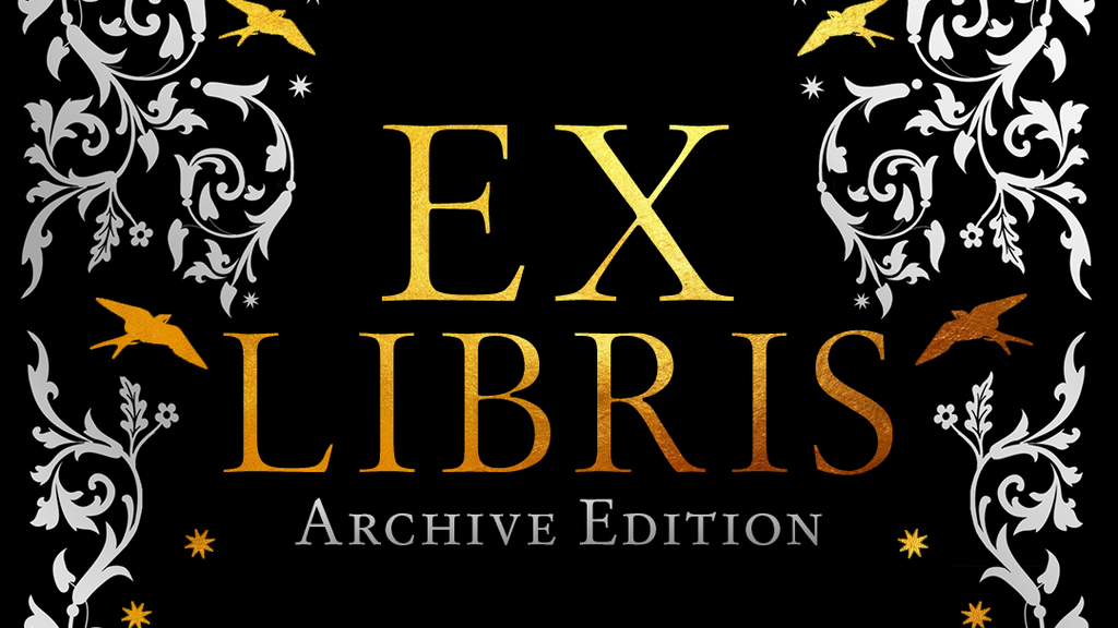
My initial ideas were purely decorative and used the full subtitle to create a more typographical package. I looked at a lot of 19th Century typefaces to evoke the period and incorporated details such as the swift silhouettes and a small row of books. I also proposed that we use marbled paper for the endpapers with an Ex Libris book plate as this was so typical of that era. I found a beautiful etching of students in their robes outside Oxford’s Radcliffe Camera which houses the Radcliffe Science Library which I knew would work perfectly as the digital sprayed edge design.

However, the team felt these cover directions lacked narrative so I developed the following design.

For this approach, I created a more delicate decorative pattern and used that to frame the suggestion of a gothic style window, through which the reader can see the rooftops of Oxford. I actually found this old etching of Oxford when I first started working on the original covers for Babel back in 2021, so it was great to finally put it to good use!
We decided that the window frame and the title should be the only gold elements on the cover, to catch the readers attention immediately and the rest of the design would be printed in a silver foil. For the endpapers the team decided to use the full Oxford scene, along with the Ex Libris bookplate so the reader would feel fully immersed in the world of Babel when they opened the book.
The final elements that brought the whole package together were the Locked Library Archive spine design and the Locked Library branded ribbon all of which were designed to work across the collection but also compliment the individual book.
Huge thanks again to Holly for taking us through the design process that brought us to the gorgeous edition we were able to send out to our Locked Library readers. Make sure to check out Holly's website to find out where her creative journey takes her next.